Visualizing Hurricane Ian Using hvPlot#
Within this post, we explore how we can use hvPlot to plot data from Hurricane Ian, which will soon make landfall in Florida.
Motivation#
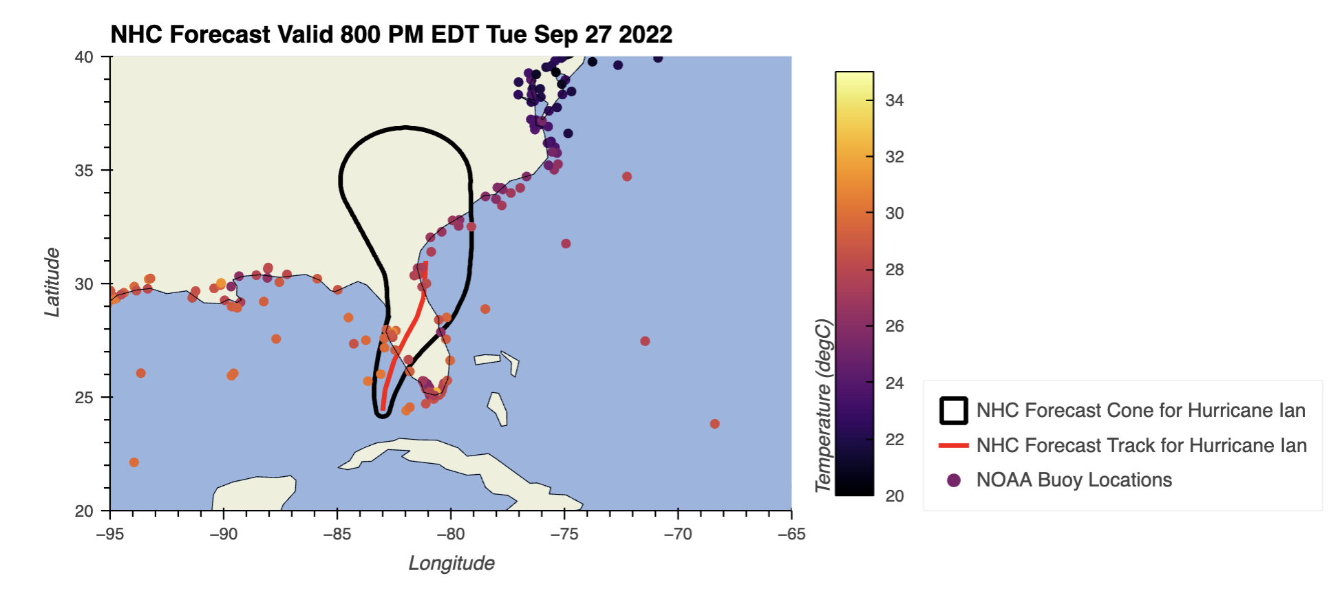
By the end of this post, you will be able to recreate the following plot:
Imports#
import cartopy.crs as ccrs
import geopandas as gpd
import fiona
from siphon.simplewebservice.ndbc import NDBC
import holoviews as hv
import hvplot.pandas
fiona.drvsupport.supported_drivers['libkml'] = 'rw' # enable KML support which is disabled by default
fiona.drvsupport.supported_drivers['LIBKML'] = 'rw' # enable KML support which is disabled by default
hv.extension("bokeh")
Access the Data#
We are interested in looking at data related to Hurricane Ian, which is currently off the Florida Coast. We want to plot the expected hurricane track, and the some surface observations from buoys, or floating platforms on water!
National Hurricane Center Data#
We are using a few different datasets here. Let’s start with the hurricane forecast from the National Hurricane Center, accessible from their Geographic Information Systems (GIS) webpage:
We need to select the kmz files (a Google GIS file standard for the Hurricane Ian cone and track.
The Cone#
A forecast cone is defines as the following, from the National Hurricane Center
The cone represents the probable track of the center of a tropical cyclone, and is formed by enclosing the area swept out by a set of circles (not shown) along the forecast track (at 12, 24, 36 hours, etc). The size of each circle is set so that two-thirds of historical official forecast errors over a 5-year sample fall within the circle. The circle radii defining the cones in 2022 for the Atlantic, Eastern North Pacific, and Central North Pacific basins are given in the table below.
One can also examine historical tracks to determine how often the entire 5-day path of a cyclone remains completely within the area of the cone. This is a different perspective that ignores most timing errors. For example, a storm moving very slowly but in the expected direction would still be within the area of the cone, even though the track forecast error could be very large. Based on forecasts over the previous 5 years, the entire track of the tropical cyclone can be expected to remain within the cone roughly 60-70% of the time.
The Best Track#
The Best Track Dataset is the best estimated track from the variety of possible scenarios.
Read the Data Using Geopandas#
hurricane_cone = gpd.read_file("../data/AL092022_CONE_latest.kmz")
hurricane_track = gpd.read_file("../data/AL092022_TRACK_latest.kmz")
hurricane_track.head()
| Name | description | timestamp | begin | end | altitudeMode | tessellate | extrude | visibility | drawOrder | ... | pubAdvTime | TCInitLocation | maxWindKnots | maxWindMPH | maxGustKnots | maxGustMPH | stormMovement | minimumPressure | snippet | geometry | |
|---|---|---|---|---|---|---|---|---|---|---|---|---|---|---|---|---|---|---|---|---|---|
| 0 | None | \n\t \t <table> \n ... | NaT | NaT | NaT | None | -1 | 0 | -1 | None | ... | 800 PM EDT Tue Sep 27 2022 | 24.4N, 83.0W | 105 | 120 | 130 | 150 | NNE | 947 | empty | LINESTRING Z (-83.00000 24.40000 0.00000, -82.... |
| 1 | None | \n\t \t <table> \n ... | NaT | NaT | NaT | None | -1 | 0 | -1 | None | ... | None | None | None | None | None | None | None | None | empty | LINESTRING Z (-83.00000 24.40000 0.00000, -82.... |
| 2 | None | \n\t \t <table> \n ... | NaT | NaT | NaT | None | -1 | 0 | -1 | None | ... | None | None | None | None | None | None | None | None | empty | POINT Z (-83.00000 24.40000 0.00000) |
| 3 | None | \n\t \t <table> \n ... | NaT | NaT | NaT | None | -1 | 0 | -1 | None | ... | None | None | None | None | None | None | None | None | empty | POINT Z (-82.90000 25.30000 0.00000) |
| 4 | None | \n\t \t <table> \n ... | NaT | NaT | NaT | None | -1 | 0 | -1 | None | ... | None | None | None | None | None | None | None | None | empty | POINT Z (-82.50000 26.60000 0.00000) |
5 rows × 30 columns
Our hurricane track file includes additional point data - we just need the line (the first row, so let’s filter based on the TCInitLocation
hurricane_track = hurricane_track.dropna(subset=["TCInitLocation"])
hurricane_track
| Name | description | timestamp | begin | end | altitudeMode | tessellate | extrude | visibility | drawOrder | ... | pubAdvTime | TCInitLocation | maxWindKnots | maxWindMPH | maxGustKnots | maxGustMPH | stormMovement | minimumPressure | snippet | geometry | |
|---|---|---|---|---|---|---|---|---|---|---|---|---|---|---|---|---|---|---|---|---|---|
| 0 | None | \n\t \t <table> \n ... | NaT | NaT | NaT | None | -1 | 0 | -1 | None | ... | 800 PM EDT Tue Sep 27 2022 | 24.4N, 83.0W | 105 | 120 | 130 | 150 | NNE | 947 | empty | LINESTRING Z (-83.00000 24.40000 0.00000, -82.... |
1 rows × 30 columns
Investigate the GeoDataframes#
Let’s check out the geodataframe. Notice how it looks like a typical dataframe, with additional geometry information.
hurricane_cone
| Name | description | timestamp | begin | end | altitudeMode | tessellate | extrude | visibility | drawOrder | ... | stormType | advisoryDate | basin | fcstpd | storm | atcfid | advisoryNum | stormNum | stormName | geometry | |
|---|---|---|---|---|---|---|---|---|---|---|---|---|---|---|---|---|---|---|---|---|---|
| 0 | None | None | NaT | NaT | NaT | None | -1 | 0 | -1 | None | ... | HU | 800 PM EDT Tue Sep 27 2022 | AL | 120 | Hurricane Ian | AL092022 | 19A | 9 | Ian | POLYGON Z ((-83.04900 24.14015 0.00000, -83.02... |
1 rows × 22 columns
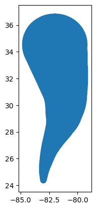
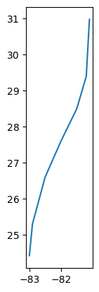
We can create static matplotlib plots using the .plot() method.
hurricane_cone.plot()
hurricane_track.plot();
Access NOAA Buoy Data#
The National Oceanic and Atmospheric Administation (NOAA) has a buoy dataset (from the National Data Buoy Center), which includes observations from around the world. We can access this data using siphon, a tool developed by the Unidata Program Center which makes accessing this dataset much easier.
We can use the .lastest_observations() method from the NDBC module to access the latest data.
buoy_df = NDBC.latest_observations()
buoy_df
| station | latitude | longitude | wind_direction | wind_speed | wind_gust | wave_height | dominant_wave_period | average_wave_period | dominant_wave_direction | pressure | 3hr_pressure_tendency | air_temperature | water_temperature | dewpoint | visibility | water_level_above_mean | time | |
|---|---|---|---|---|---|---|---|---|---|---|---|---|---|---|---|---|---|---|
| 0 | 13001 | 12.000 | -23.000 | 336.0 | 4.1 | 5.0 | NaN | NaN | NaN | NaN | 1013.3 | NaN | 27.6 | NaN | NaN | NaN | NaN | 2022-09-28 01:00:00+00:00 |
| 1 | 13002 | 21.000 | -23.000 | 37.0 | 3.5 | 4.8 | NaN | NaN | NaN | NaN | NaN | NaN | 26.1 | 26.8 | NaN | NaN | NaN | 2022-09-28 01:00:00+00:00 |
| 2 | 13008 | 15.000 | -38.000 | 14.0 | 5.7 | 7.0 | NaN | NaN | NaN | NaN | 1012.8 | NaN | 27.3 | 28.0 | NaN | NaN | NaN | 2022-09-28 01:00:00+00:00 |
| 3 | 13009 | 8.000 | -38.000 | 173.0 | 4.3 | NaN | NaN | NaN | NaN | NaN | NaN | NaN | 28.8 | NaN | NaN | NaN | NaN | 2022-09-28 00:00:00+00:00 |
| 4 | 14043 | -12.000 | 67.000 | 101.0 | 4.8 | 6.0 | NaN | NaN | NaN | NaN | 1012.7 | NaN | 24.2 | 25.0 | NaN | NaN | NaN | 2022-09-28 01:00:00+00:00 |
| ... | ... | ... | ... | ... | ... | ... | ... | ... | ... | ... | ... | ... | ... | ... | ... | ... | ... | ... |
| 894 | WYCM6 | 30.326 | -89.326 | 10.0 | 5.7 | 7.2 | NaN | NaN | NaN | NaN | 1017.7 | 1.3 | 25.9 | 26.0 | NaN | NaN | NaN | 2022-09-28 01:00:00+00:00 |
| 895 | YATA2 | 59.548 | -139.733 | NaN | NaN | NaN | NaN | NaN | NaN | NaN | 1013.2 | 0.6 | NaN | 12.0 | NaN | NaN | NaN | 2022-09-28 01:00:00+00:00 |
| 896 | YKRV2 | 37.251 | -76.342 | 30.0 | 4.1 | 4.6 | NaN | NaN | NaN | NaN | 1016.3 | 2.6 | 21.3 | NaN | NaN | NaN | NaN | 2022-09-28 01:00:00+00:00 |
| 897 | YKTV2 | 37.227 | -76.479 | 360.0 | 2.6 | 3.6 | NaN | NaN | NaN | NaN | 1016.2 | 3.1 | 20.0 | 23.5 | NaN | NaN | NaN | 2022-09-28 01:00:00+00:00 |
| 898 | YRSV2 | 37.414 | -76.712 | 230.0 | 1.0 | NaN | NaN | NaN | NaN | NaN | 1016.0 | NaN | 15.8 | NaN | 10.0 | NaN | NaN | 2022-09-28 00:30:00+00:00 |
899 rows × 18 columns
Filter the Dataset#
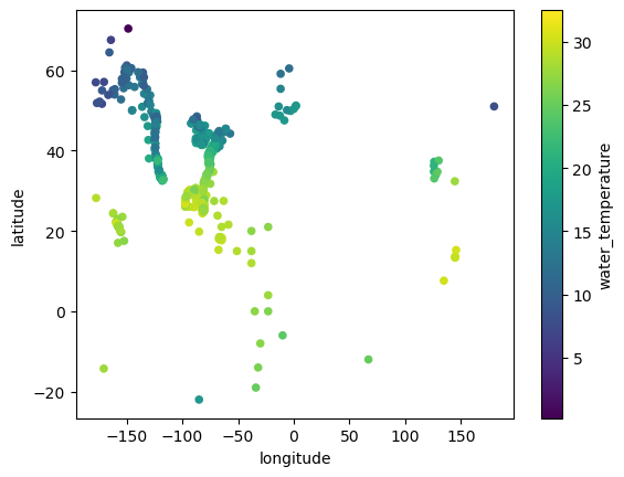
We are interested in locations that have water_temperature values, so we filter using .dropna()
buoy_df = buoy_df.dropna(subset=["water_temperature"])
buoy_df.plot.scatter(x='longitude', y='latitude', c='water_temperature')
<AxesSubplot: xlabel='longitude', ylabel='latitude'>
Plot our Data using hvPlot#
Let’s move to interactive visualization!
Plot the Hurricane Cone and Track Using hvPlot#
We can do better than just static plots - let’s create an interactive one using hvPlot!
hurricane_cone.hvplot(color='None',
line_width=3,
coastline=True,
xlim=(-95, -65),
ylim=(20, 40),
label='NHC Forecast Cone for Hurricane Ian',
projection=ccrs.PlateCarree(),
features=["land", "ocean"])
And the same for the best estimated track
hurricane_track_plot = hurricane_track.hvplot(line_color='Red',
color="None",
line_width=3,
coastline=True,
xlim=(-95, -65),
ylim=(20, 40),
label='NHC Forecast Track for Hurricane Ian',
projection=ccrs.PlateCarree(),
features=["land", "ocean"])
hurricane_track_plot
We still need a title though, since this does not tell us what time this is valid… this information is in the dataframe!
hurricane_cone.advisoryDate
0 800 PM EDT Tue Sep 27 2022
Name: advisoryDate, dtype: object
Combine our Forecast Cone and Track Plots#
Let’s add the titles, and combine our plots.
hurricane_track_plot = hurricane_track.hvplot(line_color='Red',
color="None",
line_width=3,
coastline=True,
xlim=(-95, -65),
ylim=(20, 40),
title=f'NHC Forecast Valid: {hurricane_track.pubAdvTime.values[0]}',
label='NHC Forecast Track for Hurricane Ian',
projection=ccrs.PlateCarree()
)
hurricane_cone_plot = hurricane_cone.hvplot(color='None',
line_width=3,
line_color='Black',
coastline=True,
xlim=(-95, -65),
ylim=(20, 40),
title=f"NHC Forecast Valid {hurricane_cone.advisoryDate.values[0]}",
label='NHC Forecast Cone for Hurricane Ian',
projection=ccrs.PlateCarree(),
features=["land", "ocean"])
hurricane_plot = (hurricane_cone_plot * hurricane_track_plot)
hurricane_plot
Plot the Buoy Data using hvPlot#
buoy_plot = buoy_df.hvplot.points(x='longitude',
y='latitude',
c='water_temperature',
cmap='inferno',
label='NOAA Buoy Locations',
title='NOAA Buoy Water Temperature',
clabel='Temperature (degC)',
geo=True,
coastline=True,
projection=ccrs.PlateCarree(),
xlim=(-95, -65),
ylim=(20, 40),
clim=(20, 35))
buoy_plot
Final Visualization#
Let’s put it all together! We combine our plots using the * operator.
hurricane_plot * buoy_plot
Conclusions#
Within this example, we explored visualizing data from the National Hurricane Center, and from the National Data Buoy Center. We encourage you to try this out on your own.
In the future, it would be nice to add other datasets, such as weather radar data, onto these plots as well.