Interactive Weathergami#
Motivation#
Scorigami is an interesting concept. It’s an event in sports where a final score has never happened in its history. For example, in the National Football League, a 20-17 score has happened over 285 times, but a 70-20 score has only happened once. When the Miami Dolphins beat the Denver Broncos 70-20 on September 24th, 2023, that was considered a scorigami!
Well, inspired by this, Jonathan Kahl wrote an article in the Bulletin of the American Meteorological Society describing the concept of ‘WeatherGami’, utilizing the days Maximum and Minimum temperature at a given area. Since NOAA NCEI holds all of the worlds weather data, it makes sense to see how WeatherGami works on their station database. This code reproduces the results!
Jared Rennie then wrote a notebook reproducing similar figures in a notebook, and I modified that notebook to add in some additional plotting tools to make plots interactive + easily configure a dashboard! In this example, I am interested in how common a combination of:
high temperature of 46 degrees Fahrenheit
low temperature of 33 degrees Fahrenheit is at Chicago O’Hare airport.
What You Need#
First off, the entire codebase works in Python 3. In addition to base Python, you will need the following packages installed:
requests (to access the api)
pandas (to slice annd dice the data)
matplotlib (to plot!)
cmweather (for neat weather colorbars)
holoviews + hvplot (for interactive plotting)
The “easiest” way is to install these is by installing anaconda, and then applying conda-forge. Afterward, then you can install the above packages.
conda install -c conda-forge requests pandas matplotlib cmweather holoviews hvplot
Importing Packages#
Assuming you did the above, it should (in theory) import everything no problem:
# Import packages
import json,requests,sys
import pandas as pd
import hvplot.pandas
import numpy as np
import cmweather
import holoviews as hv
import sys
import panel as pn
hv.extension('bokeh')


Accessing the Data#
Set Your Desired Location and Test Temperatures#
To access the data, we will be utilizing the Applied Climate Information System (ACIS) API, which is a quick and easy way to access our station data without downloading data locally (streaming!). Now we need to know what station to get data for. The ACIS API accepts all sorts of IDs, including:
FAA (i.e. AVL)
ghcn (i.e. USW00003812)
ThreadEx (i.e. AVLthr)
If you’re not sure, you can refer to the API documentation above. We also need a maximum/minimum combo for us to check against the database. And finally we need to give you credit for the image that is created at the end.
Change the arguments below to your liking
# Insert Arguments Here
stationID = 'ORD'
inTmax= 46.
inTmin= 33.
author='Max Grover'
The rest of the code should work without making any changes to it, but if you’re interested, keep on reading to see how the sausage is made.
This next block of code will attempt to access the data we want from the ACIS API. The API is publicly available, but sometimes there are hiccups when getting the data. We tried to account for this with a try/exept in this code block and it will let you know if it fails after 3 seconds. If this happens, wait a minute, then try again.
def get_data(stationID, inTmax=inTmax, inTmin=inTmin):

    # Build JSON to access ACIS API (from https://www.rcc-acis.org/docs_webservices.html)
    acis_url = 'http://data.rcc-acis.org/StnData'
    payload = {
    "output": "json",
    "params": {"elems":[{"name":"maxt","interval":"dly","prec":1},{"name":"mint","interval":"dly","prec":1}],
               "sid":stationID,
               "sdate":"por",
               "edate":"por"
              }
    }

    # Make Request
    try:
        r = requests.post(acis_url, json=payload,timeout=3)
        acisData = r.json()
        print("SUCCESS!")
    except Exception as e:
        sys.exit('\nSomething Went Wrong With Accessing API after 3 seconds, Try Again')

    # Get Station Info
    stationName=acisData['meta']['name'].title()
    stationState=acisData['meta']['state']

    # Convert data into Pandas DataFrame
    df = pd.DataFrame(acisData['data'],
                      columns=['Date','Tmax','Tmin'],
                     )

    # Convert the datatypes for Tmax/Tmin to be floats
    df["Tmax"] = df.Tmax.astype(float)
    df["Tmin"] = df.Tmin.astype(float)

    # Make sure data
    return df, stationName, stationState
If it says “SUCCESS!” then congrats you got the data!
Let’s check the data!#
How does it look? Well the data comes back as a JSON, which can be a little confusing to look at, so let’s extract the information we need, and reorganize it a bit.
First, the JSON has a ‘meta’ key and a ‘data’ key. The ‘meta’ key gets us info like station name, latitude, longitude, etc. And ‘data’ is the actual data we requested. So let’s get some station info, and convert the data into a pandas dataframe, which makes it easier to see.
df, stationName, stationState = get_data(stationID)
print("\nSuccessfully Orgainzed Data for: ",stationName,',',stationState)
print(df)
SUCCESS!

Successfully Orgainzed Data for:  Chicago Ohare Intl Ap , IL
             Date  Tmax  Tmin
0      1958-11-01  54.0  40.0
1      1958-11-02  53.0  37.0
2      1958-11-03  60.0  34.0
3      1958-11-04  68.0  41.0
4      1958-11-05  58.0  38.0
...           ...   ...   ...
23757  2023-11-17  60.0  34.0
23758  2023-11-18  53.0  31.0
23759  2023-11-19  54.0  35.0
23760  2023-11-20  50.0  42.0
23761  2023-11-21  44.0  36.0

[23762 rows x 3 columns]
Sometimes people want to know what the station’s period of record is, so let’s get that info.
stationStart=df.iloc[[0]]['Date'].values[0][0:4]
stationEnd=df.iloc[[-1]]['Date'].values[0][0:4]
print("Period of Record: ",stationStart,"-",stationEnd)
Period of Record: 1958 - 2023
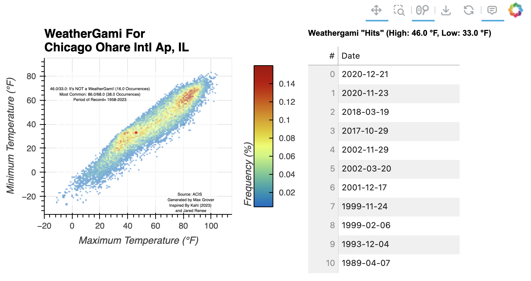
Cool, but is it a WeatherGami?#
Let’s find out! We can use some pandas calls to see if our max/min input has happened in the record before. This code block will tell you if it’s a WeatherGami or not. If not, it will tell you the other times it has happened in the record. Here, we define a WeatherGami as either happening once before, or not at all.
# Now Find if the Tmax/Tmin combo has happened in the record before (ie WeatherGami).
wgTest=df.loc[(df['Tmax'] == inTmax) & (df['Tmin']==inTmin)].sort_values('Date', ascending=False)

if len(wgTest) == 0:
    wgResult="It's a WeatherGami!"
    print(inTmax,'/',inTmin,': ',wgResult)
    print("It has never happened before!")
elif len(wgTest) == 1:
    wgResult="It's a WeatherGami!"
    print(inTmax,'/',inTmin,': ',wgResult)
    print("It has happened ",len(wgTest)," time before")
    print(wgTest)
else:
    wgResult="It's NOT a WeatherGami!"
    print(inTmax,'/',inTmin,': ',wgResult)
    print("It has happened ",len(wgTest)," times before")
    print(wgTest)
46.0 / 33.0 :  It's NOT a WeatherGami!
It has happened  16  times before
             Date  Tmax  Tmin
22696  2020-12-21  46.0  33.0
22668  2020-11-23  46.0  33.0
21688  2018-03-19  46.0  33.0
21547  2017-10-29  46.0  33.0
16099  2002-11-29  46.0  33.0
15845  2002-03-20  46.0  33.0
15752  2001-12-17  46.0  33.0
14998  1999-11-24  46.0  33.0
14707  1999-02-06  46.0  33.0
12817  1993-12-04  46.0  33.0
11115  1989-04-07  46.0  33.0
7427   1979-03-03  46.0  33.0
6956   1977-11-17  46.0  33.0
5995   1975-04-01  46.0  33.0
5634   1974-04-05  46.0  33.0
4800   1971-12-23  46.0  33.0
The other thing we might want to know is the frequency, or percentage of time a max/min combo occurrs. The followig code block does this for all combinations, and prints out the most common. We also need to weed out missing data at this point, which is recogized as ‘M’ by the API
frequency_counts = df.groupby(['Tmax', 'Tmin']).size().reset_index(name='Frequency')
frequency_counts['Percentage'] = (frequency_counts['Frequency'] / len(df)) * 100
frequency_counts=frequency_counts.loc[(frequency_counts['Tmax']!='M') & (frequency_counts['Tmin']!='M')].sort_values('Percentage', ascending=True)
frequency_counts
| Tmax | Tmin | Frequency | Percentage | |
|---|---|---|---|---|
| 0 | -11.0 | -25.0 | 1 | 0.004208 |
| 1104 | 46.0 | 44.0 | 1 | 0.004208 |
| 1106 | 47.0 | 14.0 | 1 | 0.004208 |
| 1107 | 47.0 | 15.0 | 1 | 0.004208 |
| 1111 | 47.0 | 20.0 | 1 | 0.004208 |
| ... | ... | ... | ... | ... |
| 2252 | 80.0 | 62.0 | 36 | 0.151502 |
| 2417 | 85.0 | 65.0 | 37 | 0.155711 |
| 2287 | 81.0 | 63.0 | 37 | 0.155711 |
| 2415 | 85.0 | 63.0 | 37 | 0.155711 |
| 2449 | 86.0 | 68.0 | 38 | 0.159919 |
2750 rows × 4 columns
# Get Frequency and Percentage Info needed for Plotting
frequency_counts = df.groupby(['Tmax', 'Tmin']).size().reset_index(name='Frequency')
frequency_counts['Percentage'] = (frequency_counts['Frequency'] / len(df)) * 100

# Remove Missing Data
frequency_counts=frequency_counts.loc[(frequency_counts['Tmax']!='M') & (frequency_counts['Tmin']!='M')].sort_values('Percentage', ascending=True)

# Get Frequency of input tmax/tmin and most frequent
currFreq=frequency_counts.loc[(frequency_counts['Tmax'] == inTmax) & (frequency_counts['Tmin']==inTmin)]
if len(currFreq)==0:
    currFreq=str(inTmax)+'/'+str(inTmin)+': '+wgResult+' (It has never happened before!)'
elif currFreq['Frequency'].values[0]==1:
    currFreq=str(inTmax)+'/'+str(inTmin)+': '+wgResult+' ('+str(currFreq.iloc[-1]['Frequency'])+' Occurrence)'
else:
    currFreq=str(inTmax)+'/'+str(inTmin)+': '+wgResult+' ('+str(currFreq.iloc[-1]['Frequency'])+' Occurrences)'
mostFreq=str(frequency_counts.iloc[-1]['Tmax'])+'/'+str(frequency_counts.iloc[-1]['Tmin'])+' ('+str(frequency_counts.iloc[-1]['Frequency'])+' Occurrences)'

print('Most Frequent: ',mostFreq)
Most Frequent: 86.0/68.0 (38.0 Occurrences)
Now for the fun part…
Plotting the data!#
This block of code will take the max/min combos and plot it, and color by frequency. A red dot will also plot with the max/min combo given as an input.
# Determine maximum/minimum ranges
ymin=int(5 * round(float((min(frequency_counts['Tmin'].values) - 10))/5))
ymax=int(5 * round(float((max(frequency_counts['Tmin'].values) + 10))/5))
xmin=int(5 * round(float((min(frequency_counts['Tmax'].values) - 10))/5))
xmax=int(5 * round(float((max(frequency_counts['Tmax']) + 10))/5))

# Create a heatmap with adjustable parameters
heatmap = frequency_counts.hvplot.heatmap('Tmax',
                                          'Tmin',
                                          C='Percentage',
                                          height=300,
                                          width=400,
                                          reduce_function=np.mean,
                                          ylabel=r'Minimum Temperature (°F)',
                                          xlabel=r'Maximum Temperature (°F)',
                                          xlim=(xmin, xmax),
                                          ylim=(ymin, ymax),
                                          cmap='HomeyerRainbow',
                                          clabel='Frequency (%)',
                                          alpha=.6,
                                          title='WeatherGami For \n'+stationName+', '+stationState
                                         ).opts(show_grid=True)

# Add the red dot for the maximum/minimum
feature = hv.Points([(float(inTmax), float(inTmin))]).opts(color='red')

# Add different labels to the plot
attribution = hv.Text(xmax-30, ymin+10, f"Source: ACIS \n  Generated by {author} \n Inspired By Kahl (2023) \n and Jared Renee", fontsize=4)
status = hv.Text(xmin+40, ymax-30, currFreq+'\nMost Common: '+mostFreq+'\nPeriod of Record= '+str(stationStart)+'-'+str(stationEnd), fontsize=4)

# Combine the first part of the plot by *
final_plot = heatmap * attribution * status * feature

# Add a table for the "hits"
table_results = wgTest.hvplot.table(title=f'Weathergami "Hits" \n (High: {inTmax} °F, Low: {inTmin} °F)',
                                            columns='Date',
                                            sortable=True,
                                            selectable=True,
                                            fontsize=8,
                                            height=300,
                                            width=200)

(final_plot + table_results).cols(2)
Conclusions#
This was a really fun blog post/notebook to put together! Weathergami plots can be interesting to create and visualize, and I hope this helps with getting started with the hvPlot stack with weather/climate data! In future iterations of this dashboard, I hope to add widgets to select the temperatures of interest, as well as a drop down menu for the various sites available.